Monday, 14 June 2021

๐Ÿ‘๐Ÿ‘ ๐Ÿ‘’ Ladies Day!


038 Ladies Day
(Based on Page Turner by Malika Favre)


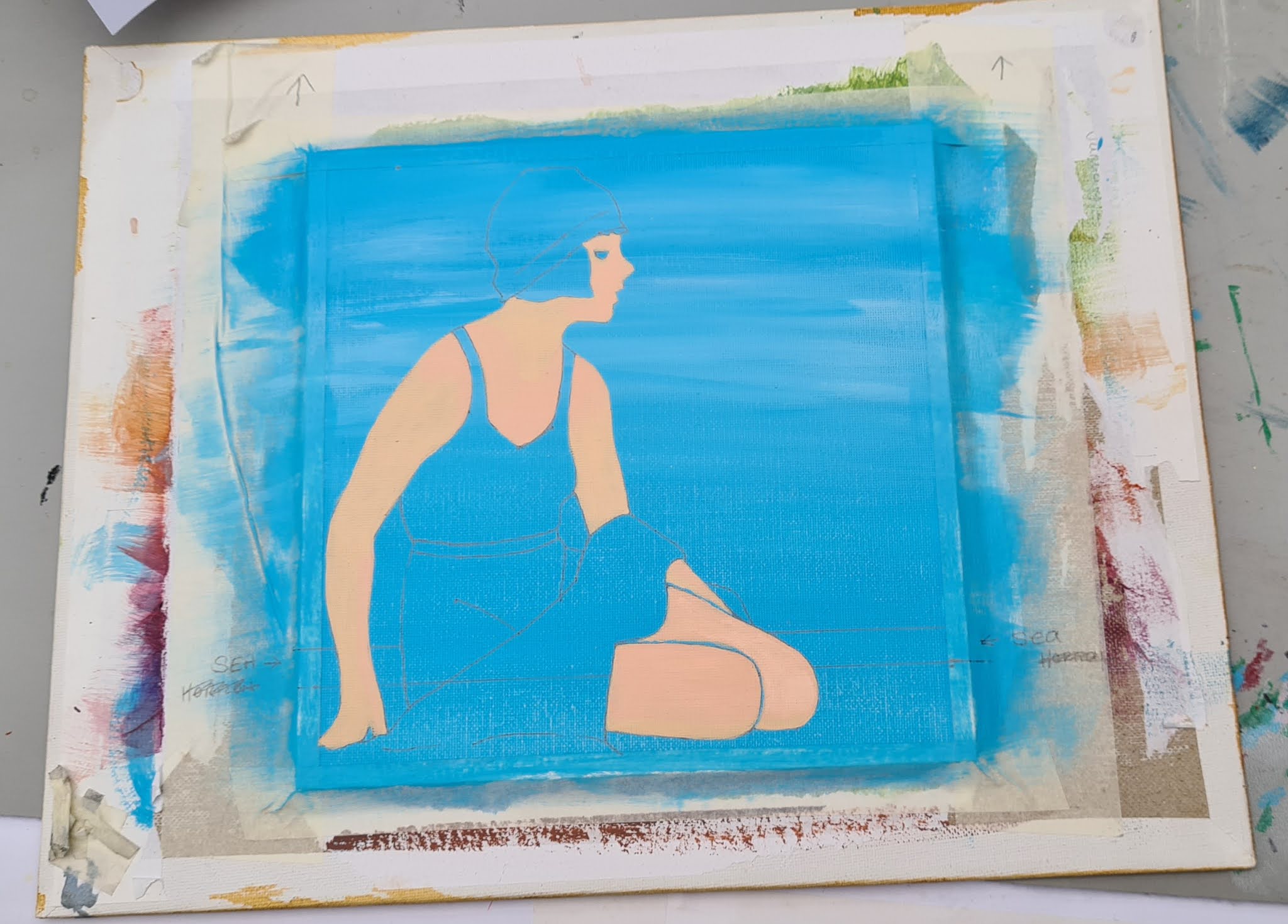
On the computer I flipped the original image round that I found on google, just to make it slightly different from the original.  I printed and cut out the woman only.  I am going to put a back to her dress, I don't like the open back.  I also decided to not give her a book in my version, well she isn't reading it anyway!!


As you can see I have drawn around the template in the above picture.  I have also sketched in the rest of the detail.  

The rest of this easy project is basically colouring in with Acrylic Paints.  


For the background here I have used Coeruleum Blue Hue.  


For the Hat and Dress I have used Mars Black. 

For Shaded Areas I used the 'Shadows' shade that I use in skin normally.  

For the Brighter areas of skin I used Soft Skin.  

The Lips were Permanent Rose, Teeth and Eye Whites were Titanium White and the eyes and brows were all Mars Black and a very fine brush.


Artist Notes: This was a really nice simple piece that was quick and fun to do. 


Friday, 11 June 2021

๐Ÿ‘ฉ‍๐Ÿฆฐ The Self Portrait - More difficult than you think!

037 Seven year old Me


(fig.1)

So I decided it was finally time to attempt a picture of myself.  At least if I mess it up it's only me I can offend!  

This photo was taken at primary school in 1978 (long before we had to wear a uniform) and it seems like a good choice, but oh good god did I hate that dress?!  

I am using my usual technique of printing the picture, cutting it out to make a template and then copying the rest in.

I also decided to paint the background before using the template (fig.1)

(fig.2)
                                
This picture looks so freaky!  

I wanted to put into practice the skills I have learned recently with skin colours and tones.  I started off as usual by painting the base colour (fig 1).  This is 

Pebeo Acrylic Paint in a 59ml bottle called 'Soft Skin' Matt.

Because the background was quite dark in this case, I needed to do a few layers of this base colour (waiting for each layer to dry, before applying the next) to give a really good covering.  If you have to do this be careful not to 'cake' the paint on.  This will show through and at the end when it is completed the overall finish of the piece can look tacky and very noticeable.  Apply the paint in small amounts and really spread it out.


(fig.3)

                                   
Once the base layer was completed in all areas where skin is visible it was time to add the next shade, Warm Glow as shown in fig.3. 

 This was made by mixing the following colours

Pebeo Acrylic Paint in a 59ml bottle called'Soft Skin' Matt.
Pebeo Acrylic Paint in a 59ml bottle called 'Rose' Matt

I applied this in areas where the skin looked pinky and warm in the photo.

(fig.4)

Fig. 4 shows the 'Highlights' stage added.  This was mixed using the following colours.

Pebeo Acrylic Paint in a 59ml bottle called 'Soft Skin' Matt.
Pebeo Studio Acrylics 'high viscosity' Titanium White Opaque

just to add a higher level of Highlight you can use the white on its own in areas of high brightness like the tip of the nose or around the eyes too.

(fig.5)

It rather does depend on the piece you are doing as to what colours you use for each of these elements.  Whenever painting a persons face it is advisable to always remember the key points.  I always do them in this order too.
 
1. Base
2. Warm Glow
3. Highlights 
4. Shadows

Now it is time to add in the Shadows (shown in fig.5) and this makes the face really come to life now.  I used two extra shades for Shadows 

Pebeo Acrylic Paint in a 59ml bottle called'Soft Skin' Matt.
Hobbycraft Acrylic Paint in 60ml bottle called 'Tan'

and

Pebeo Acrylic Paint in a 59ml bottle called'Soft Skin' Matt.
Hobbycraft Acrylic Paint in 60ml bottle called 'Tan'
Pebeo Acrylic Paint in a 59ml bottle called 'Brick Red' Matt**

** PLEASE NOTE THOUGH TO MIX THIS COLOUR I USED A TEENY TINY AMOUNT OF THIS COLOUR

Just as I had added extra Highlight (white) areas I have also added extra Shadow (grey) areas too.  (Fig.5).

(fig.6)


So in fig.6 I have painted the eyes in. If I am going to be hyper-critical the eye on the right looks bigger than the left one.  And also fig.6 also shows a slight mess up in the shading of the cheek on the left.


For the eyes I used black and greys that I already had mixed. I tried to use colours as close to that area of the original picture as possible.

(fig.7)

In fig.7 I have drawn in my teeth and painted them with the Highlights colour that I use in the skin. For the shiniest whiter bits I put in a dab of Titanium White.

I then stood back and observed. Looks OK. I took this photo (fig.7) and on close inspection of that I decided that the space of the chin (between bottom lip and bottom of chin) looked far the big, by a whole 4-5 mm.


(fig.8)

Fig.8 shows the adjustments made to the mouth area and chin. I still need to stand back and really inspect it but I think its looking ok so far.  The eye on the right does need something but I haven't quite figured out what yet.  The laugh line on the right cheek needs more shadow too.  All these tiny adjustments make a huge difference when completed.  You never know, I might get it spot on, I doubt it but you never know!

Fig.8 also shows that I have used Burnt Umber as my 'base' colour for the hair. I have only done the base colour so far and am having a break


(fig.9)

So after close inspection of the recent photo (fig.8) I altered areas that I thought needed attention.  The laugh line on the right, the eye on the right has downsized a little and I added more definition to the chin.  I then worked on the hair.  (Fig.9) is before I worked on the hair.  I mixed a light brown colour and tried to speckle thin wispy lines all over and mixing in with the brush the base Brown.  There is also some black in there too.

Then the very last thing to do was the white trim on the dress.

While it does look better to me I cannot tell if it looks like me or not.  I think not. 
Though I should be very proud of this, it is by far the best ever self portrait I have ever done, I am slightly disappointed with it too. 

Wednesday, 9 June 2021

๐Ÿ˜ Elephants on the Plains

036 Elephants on the Plains


This project has been done in exactly the same way as my 'African Savannah' that I finished at the end of May and I have even used the same tree template I made then.  I am hoping that the 'African Savannah' piece will be sold in the Charity Sale at the Hobbycraft store in Newbury so I made a similar piece for my own collection or to sell elsewhere.  It was still experimental as I wanted to see how similar to my original I could get it.  Bearing in mind that I wanted to make it physically different everything else is pretty close.  If I do manage to sell the four that have been donated, and I hope I do, I could quite easily do them again for maybe other charities too.

So of course, the first thing to do here was the taping of the border and then the Sun.  We need to make sure that a piece of canvas that is sun-shaped is kept pure white so that it can stay the nice bright focal point of the piece.  It would be no good painting the sky and then trying to put white or yellow over it, as the orange and reds would just show through.  I used the same technique as last time drew around a 5p piece and carefully trimmed around it.  I then placed it on the bare canvas where the sun will be.

After painting in the sky using Violet, Red, Orange and Yellow paints (making sure of course that the brightest part of the sky was nearest to the dot) it was time to allow it to dry and then remove the dot.  It can be a little tricky to find the edge and also you don't want to scuff your beautiful sky.  I did end up doing that on this one and had to touch it up, but you just need to take a little care and have patience.  I still think using the corner of a craft knife works well.

On this piece I painted the outer edge of the circle Yellow and the rest was white.  I couldn't remember exactly what I did last time.  But comparing photos now, I painted it all white last time and I think it looks better that way too.


Next I got my templates ready.  The Tree was reused from the 'African Savannah' and I found a picture online of a Mother and Baby Elephant.  Perfect.

The picture above shows them taped into position ready to draw around.


And now it is time to remove the templates and fill in all the lines.  I used Winsor and Newton's Mars Black for this with a few drops of Daler Rowney Flow Enhancer mixed in.  This photo was taken while colouring it in.


Monday, 7 June 2021

๐Ÿช Moroccan Arches

035 Moroccan Arches


Artists Notes: My other name for this while working on it has been 'a pain in the derriรจre' as the acrylic paint I originally used for the front wall went really strange.  This particular tube was a bit old and I think the heat had effected it today.  Anyway it has now ended up in the bin. I started this particular piece again from scratch however.  I think it looks so much better for starting again.

A simple quick piece which ended up taking the whole day!

The following photos show how the original piece developed.


It was all going so nicely, but now we have got to the dodgy paint bit.  I gave it extra layers in the hope that it would get better, but it just got worse and worse.  This is where I decided to scrap it and start again.
 Good job too I think ๐Ÿ‘๐Ÿ‘

Saturday, 5 June 2021

How I painted a 1920's Beach Beauty ⛱


Beach Beauty

I always tape my flat canvas panels to a piece of larger board.  I find it easier to work without an easel but I have a desktop sized one for when it is needed.  Taping the panel to a board gives you handling room.  As I don't use the easel I hold my canvas all the time so having it mounted onto a larger board keeps finger marks from your finished piece. To Mount it I put Masking Tape around the edges of my canvas panel, at a width of about 5mm and pressed it down firmly to give a nice crisp and clean frame.

This pic shows the template cut out ready to draw around

So as you can see I have mounted the Canvas Panel onto my larger Board with Masking Tape and I am ready to go.  In this instance, I am going to paint a background before drawing around my cutout template.


Daler Rowney Graduate Acrylic Coeruleum Blue Hue mixed with Pebeo Studio Acrylics Titanium White gave the main light blue Summer Sky.  I then added a few Titanium White wisps in (not too much) just for some wispy high cloud. 

Once it was dry I decided whereabouts the horizon would be and drew around my template (below).   I had small pieces of Masking Tape to hold it in place while I carefully drew around it.  Put them in easy places where you can fill in the detail easily after removing the template.

This pic shows the positioning of temporary tape to
hold template in place

Keep your template handy, don't throw it away as you will need it to refer to.

Rosa fills in the gaps of the template

Drawing in the rest of the details can be tricky so take your time.  Have an eraser handy, you are going to need it.

Basic outlines are drawn


I hope you can see the pencil lines in the above photo.  You just need basic outlines, I always think of it like I am creating an image in a colouring book.  You don't need to worry about the finer details at this point.  Here is a zoomed in Image.

The basic image is now transferred to the canvas panel

As I found this original image online, of course it doesn't belong to me.  I don't want my version to be a complete carbon copy of the original one so I will give the lady a different bathing suit and hat so that it has my own personal touch to it.


These photos show how I built up the skin colour using five different colours.  I especially like her upper right arm, it looks slightly sunburnt but it is actually in the shade.  But I manged to blend the colours quite well here.  

I just carried on from here.  The next areas I worked on were face and hair.  I used Mars Black and a very fine brush to get the eye just right.  With one tiny Titanium White dot in the centre.  I gave her jet black hair too.  I tried to give her hair a bit of a wavy style, typical of the art deco era.

After completing hair and face I worked on her Swimsuit and Hat.  I could not decide what colour to go for and I decided on Cream which I think was a good choice.


You can see it all coming together now.  At this point I still hadn't decided what colour the towel would be.  I felt it needed to be something different from the Cream of her suit and the blue of the sky.  I nearly went with Navy but settled on Burgundy in the end.

Friday, 4 June 2021

⛱ Beach Beauty

034 Beach Beauty
(based on California Beaches poster by Maurice Logan)


Artists Notes:  I really enjoyed painting this one.  I was inspired by the Vintage Poster by Maurice Logan I found online so I painted my own version of it.  I love this style of art and it really seems to suit my style of working.

 CLICK HERE  to read how I did it.


Wednesday, 2 June 2021

๐ŸŒฟ Leaves Tropicale ๐ŸŒฟ

033 Leaves Tropicale
                              

This was a very simple piece to complete.  I found some Tropical Leaves online and printed them, then cut them out, taped them down temporarily and drew around them.  


I drew in a couple of extra lines and some shapes and then used the following colours to complete this piece


FROM LEFT: Mars Black, Titanium White, Cadmium Yellow Hue, Clementine, Tan and
(FRONT) Burnt Sienna


Of course you can use whatever colours you like but I thought these complimented each other nicely.  In fact, I might do a similar design again but with typical British Tree leaves in Autumn colours for later in the year maybe?? ๐Ÿค”