Showing posts with label Pebeo. Show all posts

Thursday, 15 July 2021

⛱ Beach Beauty #2

034/2 Beach Beauty #2 002


This week at Hobbycraft a customer expressed interest into whether Beach Beauty was up for sale after it had been displayed on the Store Window.  The Store Manager has this week taken the display down but is hoping to re-position them somewhere else in store.  At the moment it is in storage in the Hobbycraft warehouse.

This week I am going to set a challenge for myself of making a complete new copy of this piece for myself.  And I want to try and get it as close as I can to that original.  

To follow I only have my original template, photos and blog entries for when I painted that original piece in late June 2021.

1.Painting of the Background

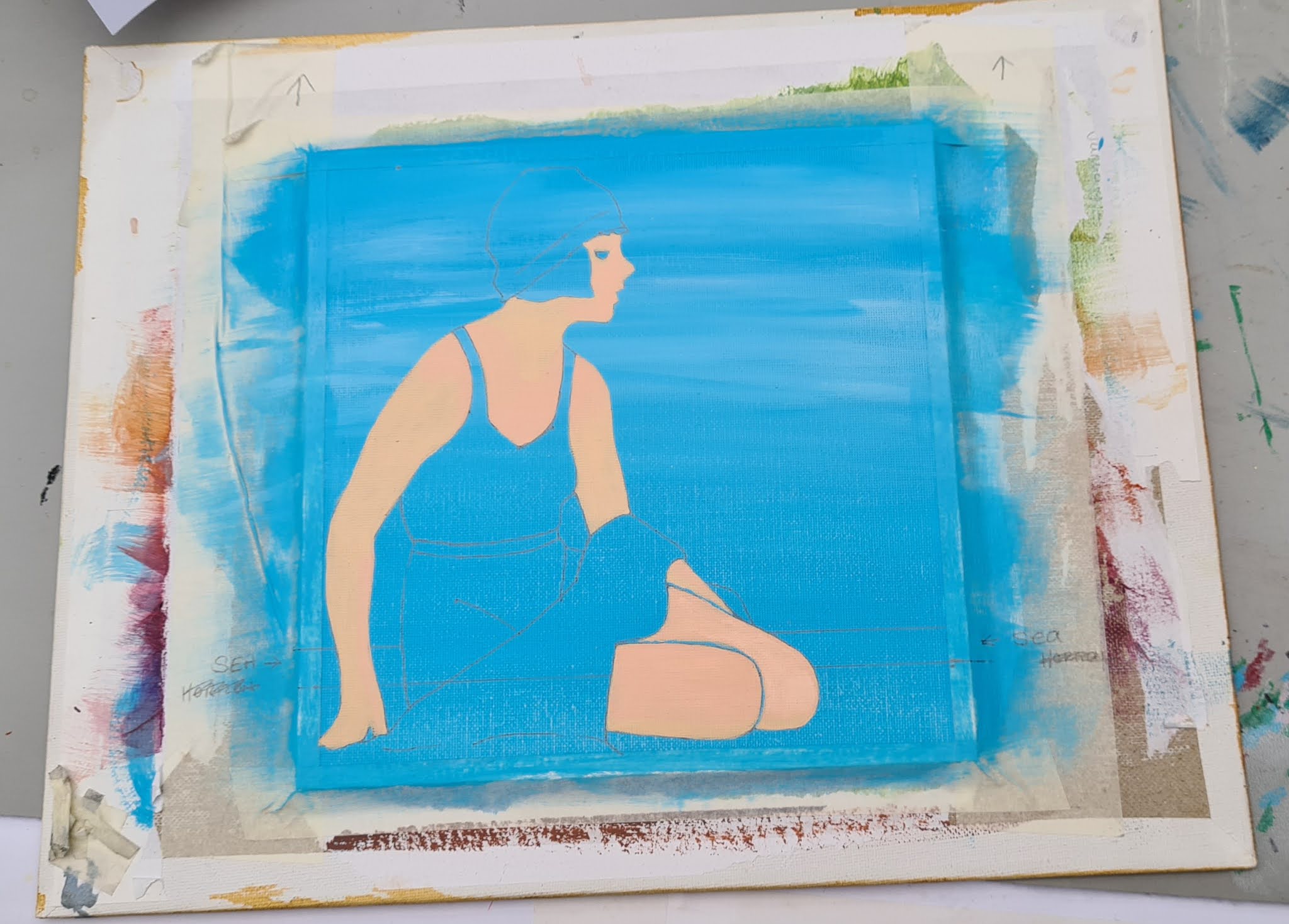
2. Drawing around the template and adding important details.

3. Starting on the skin 'BASE' colour.  This took three to four good coats to cover up the blue.

4A. Areas covered by 'Warm Glow'

4B. More Areas covered by 'Warm Glow'

5. 'Highlights' 'Titanium White' and 'Dark Shadows' are then added.

5. I have now painted her hair and facial features in Mars Black and with a fine brush.  Starting to really take good shape now.

6. I coloured the sunny areas of the Swimsuit in a nice cream colour.  It took a few layers to cover up the blue of course

7. And I then painted the shaded darker areas of the Swimsuit

8.  I have now added the twinkle in her eye, a splash of red on her lips, a belt and I added some detail on her swim hat too.

9.  I have now painted the towel a Burgundy, Wine colour like the original.  I wanted to try and create the feel of a nice thick and fluffy towel

10. Time to paint the sea in.  To create a smooth straight horizon I used an Electrician's insulation tape as it works better than masking tape.

11. I have added in the foam, sand and the lady's shadow

Artist's Notes: So the challenge here was to recreate an earlier piece as closely as possible and improve any areas which I felt necessary.  Well, I passed this test easily.  This has been recreated following my 'How I painted a 1920's Beach Beauty' Blog Post from 5th June.

Friday, 2 July 2021

🛡 The Legend of Zelda, The Wind Waker 🗡

044 The Legend of Zelda, The Wind Waker 


This was another request from Adam to help decorate our Games Room.  

The Wind Waker was released for the Nintendo Gamecube and then later a high-definition remastered version was released on the WiiU.  

It is another in the classic gaming series of Legend of Zelda.  


So I started off by painting the entire A4 sized box canvas in a light blue and allowed it to dry.  I then did my usual technique of cutting out the picture and drawing around it onto the canvas.  After I had painted the light blue background, this layer (even when dry), felt sticky and tacky.  It was a warm day today with bright sunshine and I am wondering if that was something to do with it.  It made it a little difficult to draw on.  I don't think it was the type of paint used as it was the Pebeo Studio acrylic mixed with Daler Rowney Graduate Acrylic which are two that I have never had a problem with before.  Maybe it just needs a little longer to dry thoroughly ðŸ¤”


Above you can see the original on the left and mine on the right so far.  The boat has only been painted in base colour at the moment and there is a lot of detail to go on top of this so please don't judge it as yet.

I am on the 'Colouring In with Base colours' stage upon which a lot of detail will be added later.


The 'Colouring In with Base Colours' is going pretty well I think.  I don't feel 100% happy with the way the Wood on the boat looks.  Maybe it will really wake up when more is coloured and detailed up.  Adam is very happy with how it is looking so far so it can't be too bad.  What I must must try not to do is lose hope and give up on it.  With copying a picture like this, it does end up looking different to the original.  It is my version of it so don't put that pressure on yourself.  


Have now made a start on Link


A close up of a finished Link


Am now working on the boat which is apparently called the King of Red Lions


Saturday, 5 June 2021

How I painted a 1920's Beach Beauty ⛱


Beach Beauty

I always tape my flat canvas panels to a piece of larger board.  I find it easier to work without an easel but I have a desktop sized one for when it is needed.  Taping the panel to a board gives you handling room.  As I don't use the easel I hold my canvas all the time so having it mounted onto a larger board keeps finger marks from your finished piece. To Mount it I put Masking Tape around the edges of my canvas panel, at a width of about 5mm and pressed it down firmly to give a nice crisp and clean frame.

This pic shows the template cut out ready to draw around

So as you can see I have mounted the Canvas Panel onto my larger Board with Masking Tape and I am ready to go.  In this instance, I am going to paint a background before drawing around my cutout template.


Daler Rowney Graduate Acrylic Coeruleum Blue Hue mixed with Pebeo Studio Acrylics Titanium White gave the main light blue Summer Sky.  I then added a few Titanium White wisps in (not too much) just for some wispy high cloud. 

Once it was dry I decided whereabouts the horizon would be and drew around my template (below).   I had small pieces of Masking Tape to hold it in place while I carefully drew around it.  Put them in easy places where you can fill in the detail easily after removing the template.

This pic shows the positioning of temporary tape to
hold template in place

Keep your template handy, don't throw it away as you will need it to refer to.

Rosa fills in the gaps of the template

Drawing in the rest of the details can be tricky so take your time.  Have an eraser handy, you are going to need it.

Basic outlines are drawn


I hope you can see the pencil lines in the above photo.  You just need basic outlines, I always think of it like I am creating an image in a colouring book.  You don't need to worry about the finer details at this point.  Here is a zoomed in Image.

The basic image is now transferred to the canvas panel

As I found this original image online, of course it doesn't belong to me.  I don't want my version to be a complete carbon copy of the original one so I will give the lady a different bathing suit and hat so that it has my own personal touch to it.


These photos show how I built up the skin colour using five different colours.  I especially like her upper right arm, it looks slightly sunburnt but it is actually in the shade.  But I manged to blend the colours quite well here.  

I just carried on from here.  The next areas I worked on were face and hair.  I used Mars Black and a very fine brush to get the eye just right.  With one tiny Titanium White dot in the centre.  I gave her jet black hair too.  I tried to give her hair a bit of a wavy style, typical of the art deco era.

After completing hair and face I worked on her Swimsuit and Hat.  I could not decide what colour to go for and I decided on Cream which I think was a good choice.


You can see it all coming together now.  At this point I still hadn't decided what colour the towel would be.  I felt it needed to be something different from the Cream of her suit and the blue of the sky.  I nearly went with Navy but settled on Burgundy in the end.

Monday, 24 May 2021

🔺 Geometric Rainbow Pattern of Triangles


029 Geometric Triangles

I have finally completed this bright and colourful experiment.  I love how such a simple design has made such a colourful impact.  The colours and brands I used are listed below, starting from the centre.

  1. Winsor & Newton Galleria - Mars Black
  2. Pebeo Bottled Matt Acrylic Paint - Brick Red
  3. Pebeo Bottled Matt Acrylic Paint - Blackcurrant
  4. Pebeo Bottled Matt Acrylic Paint - Fushia
  5. Daler Rowney Graduate Acrylic - Violet (450)
  6. Daler Rowney Graduate Acrylic - Ultramarine (123)
  7. Daler Rowney Graduate Acrylic - Indigo (127)
  8. Pebeo Studio Acrylic High Viscosity opaque - Cyan (49)
  9. Daler Rowney Graduate Acrylic - Coeruleum Hue (130)
  10. Daler Rowney Graduate Acrylic - Emerald (335)
  11. Daler Rowney Graduate Acrylic - Leaf Green (355)
  12. Pebeo Studio Acrylic High Viscosity opaque - Jaune (48)
  13. Pebeo Studio Acrylic High Viscosity Transparent - Magenta (50)
The Daler Rowney Graduate Acrylic needed a Flow Enhancer to make it a bit more workable.  I used Daler Rowney's Flow Enhancer and even then it needed 2 coats to give a good covering.


Friday, 21 May 2021

👑 HRH Charles, Prince of Wales


028 HRH Charles, Prince of Wales

Artists notes:  Really very pleased with the outcome of this one.  He was hard work but I think I have got him as good as I am going to get him!

Here's how I did it

So going back to my Heirs to the British Throne Collection and my challenge of painting a public Figure, as I think I'll always need to practice drawing and painting Human Beings.


The beginnings of Charles, The Prince of Wales and first in line to the British Throne.  It is using my usual technique of printing out the photo and then using it as a cutout template.  This photo shows that I have finished the background and I am now ready to work on the template.  Here is the Original Photo.

Stock Photo


Looking good so far.  The darker reds in the face may seem a little exaggerated but that tells me when I am looking at it extremely closely where darker areas need to go.

Skin colour,Daler Rowney,Winsor & Newton,Pebeo

These are the colours used for facial skin colour.  

From Left: Winsor & Newton Galleria 'Raw Sienna' 552, Daler Rowney Graduate Acrylic 'Titanium White' 011, Daler Rowney Graduate Acrylic 'Naples Yellow' 634, Winsor & Newton Galleria 'Mars Black', Pebeo 59ml 'Soft Skin' & 'Pink'

I spent the afternoon working on Prince Charles again and it is so close to completion now.    Though in every project there is always a problem area and with this one, it is his mouth.  I keep getting it wrong.  I honestly thought I had finished it today but I knew it needed better inspection this evening.


There is certainly improvement in the rest of the painting it literally is just the expression made by the mouth.  On looking closely at this photo I think I need to start the alterations in his cheek on the left hand side.  I have the smile line going up in a diagonal direction but I think it needs to have a little corner in it.  Do that first and see how it changes the expression if at all.  I think they are really small changes that are needed, but they're the ones that make the biggest impact!