Monday, 24 May 2021

๐Ÿ”บ Geometric Rainbow Pattern of Triangles


029 Geometric Triangles

I have finally completed this bright and colourful experiment.  I love how such a simple design has made such a colourful impact.  The colours and brands I used are listed below, starting from the centre.

  1. Winsor & Newton Galleria - Mars Black
  2. Pebeo Bottled Matt Acrylic Paint - Brick Red
  3. Pebeo Bottled Matt Acrylic Paint - Blackcurrant
  4. Pebeo Bottled Matt Acrylic Paint - Fushia
  5. Daler Rowney Graduate Acrylic - Violet (450)
  6. Daler Rowney Graduate Acrylic - Ultramarine (123)
  7. Daler Rowney Graduate Acrylic - Indigo (127)
  8. Pebeo Studio Acrylic High Viscosity opaque - Cyan (49)
  9. Daler Rowney Graduate Acrylic - Coeruleum Hue (130)
  10. Daler Rowney Graduate Acrylic - Emerald (335)
  11. Daler Rowney Graduate Acrylic - Leaf Green (355)
  12. Pebeo Studio Acrylic High Viscosity opaque - Jaune (48)
  13. Pebeo Studio Acrylic High Viscosity Transparent - Magenta (50)
The Daler Rowney Graduate Acrylic needed a Flow Enhancer to make it a bit more workable.  I used Daler Rowney's Flow Enhancer and even then it needed 2 coats to give a good covering.


Friday, 21 May 2021

๐Ÿ‘‘ HRH Charles, Prince of Wales


028 HRH Charles, Prince of Wales

Artists notes:  Really very pleased with the outcome of this one.  He was hard work but I think I have got him as good as I am going to get him!

Here's how I did it

So going back to my Heirs to the British Throne Collection and my challenge of painting a public Figure, as I think I'll always need to practice drawing and painting Human Beings.


The beginnings of Charles, The Prince of Wales and first in line to the British Throne.  It is using my usual technique of printing out the photo and then using it as a cutout template.  This photo shows that I have finished the background and I am now ready to work on the template.  Here is the Original Photo.

Stock Photo


Looking good so far.  The darker reds in the face may seem a little exaggerated but that tells me when I am looking at it extremely closely where darker areas need to go.

Skin colour,Daler Rowney,Winsor & Newton,Pebeo

These are the colours used for facial skin colour.  

From Left: Winsor & Newton Galleria 'Raw Sienna' 552, Daler Rowney Graduate Acrylic 'Titanium White' 011, Daler Rowney Graduate Acrylic 'Naples Yellow' 634, Winsor & Newton Galleria 'Mars Black', Pebeo 59ml 'Soft Skin' & 'Pink'

I spent the afternoon working on Prince Charles again and it is so close to completion now.    Though in every project there is always a problem area and with this one, it is his mouth.  I keep getting it wrong.  I honestly thought I had finished it today but I knew it needed better inspection this evening.


There is certainly improvement in the rest of the painting it literally is just the expression made by the mouth.  On looking closely at this photo I think I need to start the alterations in his cheek on the left hand side.  I have the smile line going up in a diagonal direction but I think it needs to have a little corner in it.  Do that first and see how it changes the expression if at all.  I think they are really small changes that are needed, but they're the ones that make the biggest impact!

Friday, 14 May 2021

๐Ÿก My Home


025 My Home


Has turned out rather well.  Painting buildings has been quite fun.  I love all the straight lines!


I have in the past attempted 3D models and pictures of the house but have never completed them, writing them off as too much of a challenge.  This one however feels quite different.  

I did this using the same technique I normally do.  I printed it off in black and white on A4 paper and cut out the buildings.  

I then drew around it so that I had a very basic outline.  Free drawing the rest in using my steel ruler,


Thursday, 13 May 2021

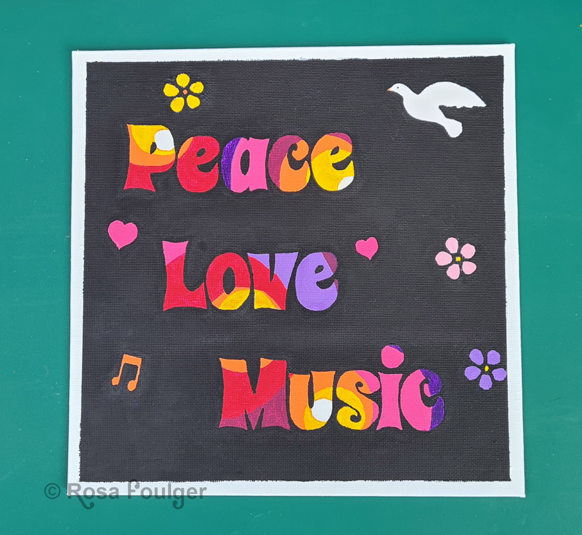
✌️Peace❤️Love๐ŸŽถMusic


027 Peace Love Music


My own design and I have proved to myself that I can use any font I like as long as it is installed on my laptop.  I can then print and cut them out to draw round.  That's exactly what I did here.

Here's how I did it


I sometimes like to add words and lettering to my pieces and in this case I wanted a very 60's, hippy feel to the art.  I have a stencil that I usually use but it is not a 60's font (or anything close to one) so I had a bit of a brainwave and it is very similar to previous templates I have used, with the only difference being, its a lot more tedious and time consuming.  It is also very much an experiment to see how well it works.  It also works out a lot cheaper than buying stencils that I will only use once or twice,

So, in Microsoft Paint I set out the words Peace Love Music and chose the font called 'Spicy Rice' to display it.  This font has a funky Nineteen Sixties feel to it.

I then carefully cut out each letter and positioned it where I wanted it on my prepared 8" x 8" canvas panel.  I secured it in place with a small piece of masking tape.  Then I very carefully drew around each letter with a sharp pencil.  See what I mean about it being tedious??

I then felt inspired by my last piece of Art, Psychedelic Swirls.  I wanted this design to be the background of each letter.  Another tedious bit.  So I got my tape reels and pots out and started drawing around them but only within the Spicy Rice letters.


I'm really loving this piece so far.  I can see it with a Pure Black Background and a few bright flowers scattered around.


I have added a Dove to symbolize Peace, Love represented by the hearts and Music Notes and flower power scattered around.  I think the Black background is really making those colours in the lettering stand out.


Wednesday, 12 May 2021

✌️☮ Psychedelic Swirls


026 Psychedelic Swirls


I want to do a few more like this.  I needed to take a break from the house painting and wanted to do something bright and cheerful.  

Inspired by the paint pour picture I did entitled 'Lava Lamp' I wanted to give a mid to late 1960's vibe and I think it works well, some paints flowed better than others and the ones that didn't flow so well are noticeable unfortunately but this is a really nice result all the same.

I need to buy something called a Flow Enhancer that helps with acrylic paints.


Here I drew round a small reel of tape, a slightly bigger pot and then around a reel of masking tape, drew a couple of wiggly lines and chose my colours carefully, all while listening to some funky Jamiroquai!


Monday, 10 May 2021

๐Ÿ”ด๐ŸŸก๐ŸŸข๐Ÿ”ต⚫ Lava Lamp

024 Lava Lamp


Using Violet, Pink and Red acrylics mixed with a pouring medium, this was my second attempt at Paint pouring.  Quite a messy business ๐Ÿ˜‡

๐Ÿ”ด๐ŸŸก๐ŸŸข๐Ÿ”ต⚫ Splodge

023 Splodge


My first attempt at paint pouring using the spectrum colours and black.  Earlier on I put it aside to dry and wasn't that impressed but looking back at it now, its actually quite intricate.  Not bad at all really.  


It reminds me of contours on a map!