Tuesday, 29 June 2021

💋 Marilyn

042 - Marilyn


So with this one I decided to paint the whole canvas panel with Titanium White to begin with, before even putting on the Masking Tape borders.  After it had dried it gave the canvas a bit of a yellowy tinge.  I thought it was probably what Gesso (a primer) is but I am not sure that is correct.  I am yet to discover if Gesso is worth doing or not.  Painting the canvas panel white to begin with certainly has made a smoother surface to draw upon.  

I guess the only way I can learn if Gesso makes a difference is to buy some and try it out.  


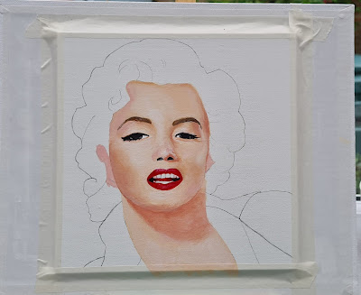
I have drawn around my template of Marilyn Monroe and drawn in other details too.  At the moment she looks very goofy and frightening but remember this is a rough guide.  I always try not to put in too much detail at this point as it can bog you down and I like to try and keep it nice and simple.


The skin of the face and neck areas are first painted with  3 coats of the Base Colour.  The Eyebrows and Lips have been coated in one layer of the base colour.  And with every new layer will be now left clear until painting those areas.


Warm Glow has now been added.


Highlights are now added.  On the right cheek in this pic it looks as if I have added some darker shading but is where the paint has smudged the pencil.


On top of the Highlights layer I added a Titanium White layer too.  I then added the Light Shadows.


And in this photo above I have now added the Darker Shadows.  I am having a break from it at the moment but as I always do, I am sitting back and examining photos of my work and I can easily pick out areas that need extra attention.  The main one so far is the Right Brow area looks the wrong shape.  I'm haven't quite made up my mind yet but I think the dark shadows might be a little too dark.  I also want to try and make the skin look smooth.  Marilyn Monroe was such a glamour icon I do not want her skin to look lumpy and bumpy with craters!  It is quite a challenge but it is one I am enjoying.

I went back to Marilyn and corrected the eyebrow on the right and then carried on with all the facial features.  And as I thought as soon as the eyes were there the whole face just came alive.  Mega pleased with this so far.  There is absolutely no mistaking who this is meant to be a painting of.


Now I will look at my latest photo and see again if there is anything that needs adjustment. 

It is good for me to be critical as it makes me do the very best painting that I can.  But I have learnt to only start work on the adjustment after much thought of exactly what course of action to take.

It is very strange how I can only spot the areas needing extra work when I am looking at a photo of it.  I guess, where I am looking at the actual piece in such detail while working on it I am not looking at it as someone else will.  The photo shows it as a whole and any adjustments normally present themselves within the first few seconds of examination.

After close inspection of this piece, I think the Mouth in its left corner looks a little awkward and also the space between the eyes at the bridge of the nose needs to even up a bit too.  Marilyn had the perfect facial bone structure, but so far this Marilyn does not. 😊


So this morning I have worked on the areas which I highlighted as needing work.  They have made strong but subtle differences.  I will now leave the bottom left lip alone as I don't think I can improve that area any more.  The bridge of the nose still needs something and what really stands out to me during this inspection was the left highbrow maybe needs extending more.  The jury is still out on that at this present time.  

One area I will work on next is the Philtrum area between the nose and the top lip.  The centre of the Cupids Bow is a few millimetres off from where I think it should be.  This shouldn't be a huge job but I must have a clear idea of what action to take before starting.  I should only need to use both lip reds and the 'highlight' skin colour to rectify this.


Hopefully the picture above demonstrates what I mean about the Philtrum area.

It may well be only a small detail but once I had spotted it I just had to change it as I would forever be drawn to it.  I think it looks a lot better for the change too.  I have finished the face for now.  The finishing touch to this piece will be the beauty spot mole on the right cheek.  It has not been forgotten.  


So as you can see I have decided to leave the face alone now and this afternoon I have been working on Background, Shoulders and her Top.  The Shoulder on the right needs a little more highlighting with Titanium White which I have noted from this last photo.

I have now made a start on the hair.  This will need as much work as the face has has had.  I started off by using brown to mark the darker areas of the hair and then went over all the hair (including all brown areas) with the Highlights (Skin Tone).  This seems to have fitted the colour match very well.  I have also used some cream that I had already mixed and have used titanium white for hairs highlights.  There is a lot of detail to work on here, so I really do not want to rush this stage.


In fresh daylight this morning I have carried on working on Marilyn's Platinum Blonde hair.  There are a lot of colours used in here.  Yesterday I used some dark brown on shady areas and today I have painted over them relying on the dark to show through and lighten the shade.  It is working well.  

Maybe the hair doesn't need as much work as I previously thought.  I think it could be very easy to overdo it.  At the moment, on the hair there is nothing jumping out at me saying it needs improvement either.  

I went on from here to tidy up what was left and finished up around the ears, earrings and beauty mark.  Really very happy with it!

Wednesday, 23 June 2021

🐝 Bee Kind

041 Bee Kind

 Saw something very similar to this on Pinterest and wanted to do my own cute version.  I started off by painting a prepared canvas panel with Titanium White.  I then drew my design lightly on top of that.


I then mixed up a few different shades of yellow with hints of Orange and started colouring in the Honeycomb.  With this piece this is what took the time.  I also added some darker or lighter areas to each one.  I then coloured in the bee giving him a cute character. 

To do the lettering I didn't have a stencil with large enough lettering for this project so I went onto my computer and opened the Microsoft Paint program and used the Text tool and wrote Bee Kind on the blank page.  I then selected it into a font that I liked and resized it too.  After this I used my usual method of printing and cutting it out then drawing around each letter on my canvas.

I know it is a long drawn out process but it works well and you can use any font you like as long as it is installed on your Personal Computer of course.


This photo shows some of the lettering has been pencilled in.  I put some masking tape on and drew a level line on it so that the lettering was straight.  I have made mistakes with getting lettering straight in the past so wanted to try this.  I think it has worked well too.  You really can never have too much masking tape!  After both words were drawn round I then coloured them in carefully with a fine brush and with a steady hand using Mars Black.  

This was a fun little project with a very important message we could all take on board.

Monday, 21 June 2021

🌿 Eucalyptus 🌿


040 Eucalyptus

This was a nice easy little project for a rainy Midsummer's day.  I was inspired by a similar artwork that I came across on Pinterest.  I looked for a Eucalyptus leaf 'clip art' online and did my usual technique of printing it out, then cutting it out.  I then drew round a large circular object which I randomly divided and put a smaller circle in and coloured in with complimentary colours.  

This shows the piece that inspired it. 
This was after drawing the design onto the canvas panel


This was very much along the same lines as Leaves Tropicale which was a very similar artwork that I did in early June.

Thursday, 17 June 2021

💋 Ruby


039 Ruby
(Based on Similar works by Malika Favre)


Following on from Ladies Day which I painted recently I wanted to do another in the same sort of style.  I found a picture online that appeared on the front cover of a magazine called Woman.  I am not sure who the original artist is although it is very similar to Page Turner by Malika Favre, the inspiration for my last piece, Ladies Day. 


For this piece I did it by splitting the flipped picture into two seperate templates.  I did this because I wanted to be 100% sure of the hair lines position.  I probably could have free drawn it in but I have started it this way now so may as well follow it on.


The edges have now been drawn around and I am now about to start the free drawing of the facial features.


All is fully drawn in now and we are now ready for the fun bit - Colouring it in!

A close-up of the features


The background was painted using Daler Rowney's Graduate Acrylic Cadmium Red Deep Hue (504).


Then I put in all the Black areas using Winsor & Newton Mars Black.


I then went back to the same Red as the background and coloured in her hair and lips.  I have now decided to give her an eye which I am fairly confident of drawing in.


For the Brighter areas of skin I used Soft Skin.  The eye has been drawn in in this photo but does look odd.  Hopefully it will look right.


For the middle shaded areas I used the 'Shadows' shade that I use in skin normally.

And real dark shadows were painted the same Mars Black as all others.  As you can see from the photo above, I have drawn in both eyes and it does look a litte weird because the original image that inspired me doesn't have eyes for it's an art style.  Mine will be different.  Oh and don't forget to paint in the Nostrils!


So I started off by painting in the bright whites with Titanium White making sure there were a good few layers of it to completely cover my pencil sketch marks.


Then a Fine brush and the Mars Black were back to start defining the eyes with some eyeliner and mascara.


And a couple of Titanium White dots to finish off.


Monday, 14 June 2021

👝👠👒 Ladies Day!


038 Ladies Day
(Based on Page Turner by Malika Favre)


On the computer I flipped the original image round that I found on google, just to make it slightly different from the original.  I printed and cut out the woman only.  I am going to put a back to her dress, I don't like the open back.  I also decided to not give her a book in my version, well she isn't reading it anyway!!


As you can see I have drawn around the template in the above picture.  I have also sketched in the rest of the detail.  

The rest of this easy project is basically colouring in with Acrylic Paints.  


For the background here I have used Coeruleum Blue Hue.  


For the Hat and Dress I have used Mars Black. 

For Shaded Areas I used the 'Shadows' shade that I use in skin normally.  

For the Brighter areas of skin I used Soft Skin.  

The Lips were Permanent Rose, Teeth and Eye Whites were Titanium White and the eyes and brows were all Mars Black and a very fine brush.


Artist Notes: This was a really nice simple piece that was quick and fun to do. 


Friday, 11 June 2021

👩‍🦰 The Self Portrait - More difficult than you think!

037 Seven year old Me


(fig.1)

So I decided it was finally time to attempt a picture of myself.  At least if I mess it up it's only me I can offend!  

This photo was taken at primary school in 1978 (long before we had to wear a uniform) and it seems like a good choice, but oh good god did I hate that dress?!  

I am using my usual technique of printing the picture, cutting it out to make a template and then copying the rest in.

I also decided to paint the background before using the template (fig.1)

(fig.2)
                                
This picture looks so freaky!  

I wanted to put into practice the skills I have learned recently with skin colours and tones.  I started off as usual by painting the base colour (fig 1).  This is 

Pebeo Acrylic Paint in a 59ml bottle called 'Soft Skin' Matt.

Because the background was quite dark in this case, I needed to do a few layers of this base colour (waiting for each layer to dry, before applying the next) to give a really good covering.  If you have to do this be careful not to 'cake' the paint on.  This will show through and at the end when it is completed the overall finish of the piece can look tacky and very noticeable.  Apply the paint in small amounts and really spread it out.


(fig.3)

                                   
Once the base layer was completed in all areas where skin is visible it was time to add the next shade, Warm Glow as shown in fig.3. 

 This was made by mixing the following colours

Pebeo Acrylic Paint in a 59ml bottle called'Soft Skin' Matt.
Pebeo Acrylic Paint in a 59ml bottle called 'Rose' Matt

I applied this in areas where the skin looked pinky and warm in the photo.

(fig.4)

Fig. 4 shows the 'Highlights' stage added.  This was mixed using the following colours.

Pebeo Acrylic Paint in a 59ml bottle called 'Soft Skin' Matt.
Pebeo Studio Acrylics 'high viscosity' Titanium White Opaque

just to add a higher level of Highlight you can use the white on its own in areas of high brightness like the tip of the nose or around the eyes too.

(fig.5)

It rather does depend on the piece you are doing as to what colours you use for each of these elements.  Whenever painting a persons face it is advisable to always remember the key points.  I always do them in this order too.
 
1. Base
2. Warm Glow
3. Highlights 
4. Shadows

Now it is time to add in the Shadows (shown in fig.5) and this makes the face really come to life now.  I used two extra shades for Shadows 

Pebeo Acrylic Paint in a 59ml bottle called'Soft Skin' Matt.
Hobbycraft Acrylic Paint in 60ml bottle called 'Tan'

and

Pebeo Acrylic Paint in a 59ml bottle called'Soft Skin' Matt.
Hobbycraft Acrylic Paint in 60ml bottle called 'Tan'
Pebeo Acrylic Paint in a 59ml bottle called 'Brick Red' Matt**

** PLEASE NOTE THOUGH TO MIX THIS COLOUR I USED A TEENY TINY AMOUNT OF THIS COLOUR

Just as I had added extra Highlight (white) areas I have also added extra Shadow (grey) areas too.  (Fig.5).

(fig.6)


So in fig.6 I have painted the eyes in. If I am going to be hyper-critical the eye on the right looks bigger than the left one.  And also fig.6 also shows a slight mess up in the shading of the cheek on the left.


For the eyes I used black and greys that I already had mixed. I tried to use colours as close to that area of the original picture as possible.

(fig.7)

In fig.7 I have drawn in my teeth and painted them with the Highlights colour that I use in the skin. For the shiniest whiter bits I put in a dab of Titanium White.

I then stood back and observed. Looks OK. I took this photo (fig.7) and on close inspection of that I decided that the space of the chin (between bottom lip and bottom of chin) looked far the big, by a whole 4-5 mm.


(fig.8)

Fig.8 shows the adjustments made to the mouth area and chin. I still need to stand back and really inspect it but I think its looking ok so far.  The eye on the right does need something but I haven't quite figured out what yet.  The laugh line on the right cheek needs more shadow too.  All these tiny adjustments make a huge difference when completed.  You never know, I might get it spot on, I doubt it but you never know!

Fig.8 also shows that I have used Burnt Umber as my 'base' colour for the hair. I have only done the base colour so far and am having a break


(fig.9)

So after close inspection of the recent photo (fig.8) I altered areas that I thought needed attention.  The laugh line on the right, the eye on the right has downsized a little and I added more definition to the chin.  I then worked on the hair.  (Fig.9) is before I worked on the hair.  I mixed a light brown colour and tried to speckle thin wispy lines all over and mixing in with the brush the base Brown.  There is also some black in there too.

Then the very last thing to do was the white trim on the dress.

While it does look better to me I cannot tell if it looks like me or not.  I think not. 
Though I should be very proud of this, it is by far the best ever self portrait I have ever done, I am slightly disappointed with it too. 

Wednesday, 9 June 2021

🐘 Elephants on the Plains

036 Elephants on the Plains


This project has been done in exactly the same way as my 'African Savannah' that I finished at the end of May and I have even used the same tree template I made then.  I am hoping that the 'African Savannah' piece will be sold in the Charity Sale at the Hobbycraft store in Newbury so I made a similar piece for my own collection or to sell elsewhere.  It was still experimental as I wanted to see how similar to my original I could get it.  Bearing in mind that I wanted to make it physically different everything else is pretty close.  If I do manage to sell the four that have been donated, and I hope I do, I could quite easily do them again for maybe other charities too.

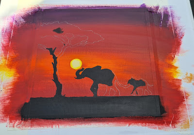
So of course, the first thing to do here was the taping of the border and then the Sun.  We need to make sure that a piece of canvas that is sun-shaped is kept pure white so that it can stay the nice bright focal point of the piece.  It would be no good painting the sky and then trying to put white or yellow over it, as the orange and reds would just show through.  I used the same technique as last time drew around a 5p piece and carefully trimmed around it.  I then placed it on the bare canvas where the sun will be.

After painting in the sky using Violet, Red, Orange and Yellow paints (making sure of course that the brightest part of the sky was nearest to the dot) it was time to allow it to dry and then remove the dot.  It can be a little tricky to find the edge and also you don't want to scuff your beautiful sky.  I did end up doing that on this one and had to touch it up, but you just need to take a little care and have patience.  I still think using the corner of a craft knife works well.

On this piece I painted the outer edge of the circle Yellow and the rest was white.  I couldn't remember exactly what I did last time.  But comparing photos now, I painted it all white last time and I think it looks better that way too.


Next I got my templates ready.  The Tree was reused from the 'African Savannah' and I found a picture online of a Mother and Baby Elephant.  Perfect.

The picture above shows them taped into position ready to draw around.


And now it is time to remove the templates and fill in all the lines.  I used Winsor and Newton's Mars Black for this with a few drops of Daler Rowney Flow Enhancer mixed in.  This photo was taken while colouring it in.